Tuesday 15 November 2011

1 - In what ways does your media product use, develop or challenge forms and conventions of real media products?


Above are conventions of real media products which, some I have followed and some which are flouted, below explains the conventions which we used in our own media products in comparison with real media products.

The Video
Editing -
The editing of our video was important, our final look follows a conventional look of this particular genre. Here is two example vidoes which have similar aspects to our video.


As you can see these videos use black and white throughout their video and also has a 'grungy' look. This is similar to our video as we also have used black and white effects with a high contrast to create a specific effect in our music video. It contains a lot of jump cuts which aim is to keep the audience interested and show the narrative from different angles. For example, when Jono is getting ready we use jump cuts between each different stage of getting ready, this helps pick up the pace of the video to match the music, which also increases it's tempo.

INSERT VIDEO

Camera Work -
The camera work which is used also fits the conventions of a music video. It contains a mixture of shots from close ups to long shots. However, possibly in a music video conventionally people would expect more close up shots, which Pete Fraser says suggests intimacy with the artist. Throughout the music video a mid-shot is probably the most used shot. As our video is focussed on a band conventionally it uses panning shots, for example the one of Jamie on the drums.


Also a range of angles so all the band can be seen. For example this shot of Chris in the front with Jamie and Chris S still being seen in the back and similarly Chris S in the front and the rest in the back.


Our music video has also partly followed Goodwins theory of music videos as the we have tried to match the narrative side of the video to the lyrics, so it clearly illustrates what happens. For example, when Jono walks up the stairs with Daisy and there is a shot of them closing the door. This matches with lyrics 'We have a litte dance, and I'm sure that I'm in, Have a mint night out with a happy ending' Obviously connotating sex. 

The Magazine Advert


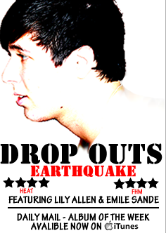
As you can see from the annotation of our magazine we have followed a lot of the conventions which are typical of a magazine advert. However, conventions which are common in a magazine advert includes an image of the entire band. As you can see the image is only of one person as a feature for the magazine article. In the draft we did use the band for the image however it wasn't clear enough and brought the quality of the image down. As you can see the quality of images are totally different: 


Therefore we think that although the band isn't used for the photo the image which is used is effective as it makes the magazine advert looks more professional and effective. 


The Digipack 
The digipack also follows lots of the conventions which are typical of a real digipack. Similar to the magazine, some people would expect to see a picture of all of the band on the front whereas ours only has one person on the front cover. The colour scheme is simple and  most of it is in black and white. The images being all the same colours help make the images fit better together.


2 - How effective is the combination of your main product and ancillary texts?

3 - How did you use new media technologies in the construction and research, planning and evaluation stages?


The camera, a Canon 550D, we had never used before, therefore had to become familiar with how to use it so we were able to film effectivley and not waste time. To start with the camera was difficult to use, however, once we had both practiced using it it seemed quite easy to get a hang of. The main buttons which we had to use which seem self-explanatory are shown below:


The turning of the focus on the front makes a huge effect on the shot and shows how much it changes the focus. For example, here is a video which shows the changes between shots in focus and out of focus.


Also there are screen shots where you can compare the difference. As you can see the first shot is blurry, in comparison with the second shot, where his hand is seen clearly. This is something we had to take into consideration when we were filming as especially when the actor is moving around the camera can slip out of focus, therefore not producing clear shots.


4 - What have you learned from your audience feedback?

Audience Feedback
by: ltye


Our aim for our music video was to promote our band and attract a wide audience to the genre or indie/rock. The audience feedback which we have recieved has helped us see if we have achieved our aim and created an interesting music video, which seems similar to real music videos, which our audience will like to watch. Also make them recognise the band and listen to them in the future.

Key words on positive feedback -


Key words of Criticisms -


From the feedback which I have received about the music video I have learnt people's opinions of the video. Many people enjoyed the beginning of the video and found it very interesting due to the amount of variety of shots it showed. Also the switches between the narrative and performances help kept the audience watching, however a lot of people agreed that towards the end there is not as much narrative and the performance starts to become repetitive therefore the video starts to get boring. 

The audience thought the actors did a great job throughout the video which they thought helped make the video more professional. They thought the actors were realistic to the story line and were also confident when performing. The miming and playing of the instruments were very in time with the music which also adds to the professional feel. 

Editing for the music video was shown to be successful and the audience liked the 'grungy' look which was created by the high contrast black and white shots. Some people in the audience thought the shots created a suitable mood for the genre and related well with the band. However some comments believed some of the shots were slightly dark and could have been clearer in some places to create a professional vibe all the way through.


Final Video - Actin' A Disgrace


New location
Our original video location included the Manor pub and Kristina Lowes house, however the footage which we got from these are not good quality therefore during the re-shoot of the footage for the video we have changed the location. Where Jono is getting ready and walking down the stairs that is filmed at his house in Chilwell. PICTURE. Our other location where you see all of the group of friends drinking is at Tom Liddingtons house. We choose not to film at Kristinas house again as in the re-shoot we were using a boy as the main character therefore using a girls bedroom wouldbt be realistic therefore, using a boy's room was appropriate. Also we didnt film at the manor again as the footage which came from there seemed very dark effecting the quality of the camera. Therefore we choose a house as here we can experiment with the lighting which we can't do in a public place. I think that this did work in our favour as the shots that we have from both of the new loactions are well-lit, realistic and clear.


New Actors
Feedback from our first draft said that it would be more appropriate to use male actors for the narratives as the song is based on a lads night out. Therefore we got new actors instead of using Daisy, to try and improve the video. However Daisy is still in the shot as the song does mention having a girl in it, howeber she is not the main character and instead we used Johnathon Norton as the main character.

Jono Norton
Aged 18  - His role is to be filmed getting ready, as if going on a night out and meeting his friends and getting drunk.


Extras


Will Norton
Aged 18 - His role is to be one of Jono's group of friends and is getting drunk with him.


Jack Hodson
Aged 18 - His role is the same as Wills and is one of the group of lads.


Along with these extras there is also many others who show throughout the video. By having a lot of people in the clip it seems realistic in that a large group would go out and get drunk together. People include: James Brazier, Lewis Herceck and Charlotte Meadwell.

Wednesday 2 November 2011

Final Magazine Advert


Construction
After receiving feedback feedback on my first draft I have made some final changes to produce a final magazine advert. I have completely changed the image that is on the advert to match the image which is on the front of my digipack. I believe this image works much better than the previous one as it is more focussed, clearer and more appealing to the audience. The font and colours also match the digipack. I have kept a similar layout to the first draft as this got good feedback. The colour scheme is also the same following the black and red. I have also included the iTunes symbol on the poster allowing the audience to know where to buy the album. It has still kept to the conventions which are typical of a magazine poster. It has ratings on and also related companies. 
Feedback

Final digipack cover


Construction
After gathering feedback on the first digipack I have redrafted it to try and improve it and make it more professional and conventional. I have changed the image on the front of the digipack to one which is more captivating and not so dark. It is also of the person who is featured throughout the video for Drop Outs. As the image has a high contrast the fonts which are used stand out even more. The image on the inside also has a quote from the band and the bands name on on the inside. I think this makes the digipack more personal as the individual members are named. The image which was originally used on the inside of the digipack i have now move to the back cover, and also made it grey scale. I did this as throughout the rest of the digipack all of the images are simple following mostly black and white colours. Therefore having a brightly coloured photo in the middle made it seem out of place. Therefore to make it fit in better with the rest of the digipack I have made it black and white with the red font for the track list. I have also added a barcode and small print of where it was produced, conventional of a usual digipack. 

Feedback


Draft Magazine Advert


Construction
Following a similar theme to the digipack cover I tired to use similar fonts and colours. A magazine has similar conventions to a digipack. When making the magazine cover I also only used to different colours throughout to keep the text simple. This is so the writing doesn't completely distract the audience from the image. The image is of the band playing the instruments. This is also seen in the video from 'Actin' a Disgrace' Included on the magazine includes ratings and places available to buy the album. The fonts which are used also are similar to the Digipack.

Feedback
After gathering feedback on my magazine advert, people commented saying they like the simple colour scheme and the text looks really professional and effective. Also they like the layout as it attracts attention to the image as it is in the middle. However, the image is described as weak and the lighting of the shot isn't great. Also the photo is too naturalistic and normally in magazine adverts the people in the photo normally have more of a pose. Also industry icons were recommended to put on, such as iTunes or HMV. 


Draft Digipack Cover


Construction - 
When making the digipack I tried to stick to many of the typical conventions. I have tried to keep the theme throughout simple. Therefore I used only two different fonts throughout. One for the front cover and one for the track list on the back. I also stuck to a limit of two colours for the font which were white and red. I used these colours as they are bright and bold and stand out against the black image which is used, this creates a contrast. The images which i have used consist of an amplifier, drums and a guitar with plectrum. These images are conventional as they are relevant to the band. The instruments are also ones which are used in the video. The images which are used are also similar on the back and the front which is also conventional. 

Feedback - 


Sunday 16 October 2011

First Draft - Actin' A Disgrace


Making the first draft
The Band
We had booked out the drama room and got permission to film in the drama room after school. Me and Kristina arrived there early so we could set up the band equipment so when the actors got there the process of filming would be a lot quicker. However not everything went to plan. Firstly, the speakers in the room did not have an auxiliary plug therefore we could not connect my phone to the system. Therefore we had to quickly burn the track onto CD so that we could get it to work. Secondly, the light board which turns on all the spot lights was very difficult to use and we had no clue how to use. Luckily we managed to find out how to turn them on and then we could experiment with the different lighting, so eventually it did work out it was just extremely difficult to start off which was worrying as if we couldn't get the lights to work there was no possible way we could film. Once we started filming everything seemed to be going fine and we managed to get some good footage of the band. However due to the temperature of the room being really hot the camera kept overheating which caused more problems. However after going through the song numerous times and trying to get big range of shots from different angles we managed to get all the footage that we needed.
Daisy
Shooting this footage fortunately had less problems than shooting the band. Being able to shoot the footage with less problems meant that everything was done a lot quicker which managed our time more effectively. The only problem which we faced when shooting Daisy was lighting, although the lighting at Kristina's house was bright and looked good on the footage the outside shots and the shots inside The Manor Pub were very dim and this reflected in the footage as it was dark and the quality was very bad. This also showed in the feedback as people agreed with this.


As you can see from the images it is very dark in the background therefore its not surprising that the footage turned out dark. I think this is definitely a lesson learned as if he do a reshoot we will make sure  that its the right time of the day for the footage to turn out with better lighting.


Feedback
After people watching our video they then gave us some feedback, people said that the footage of he band is well shot and the lighting looks good and the performance by the actors is very well done and looks professional which gives an overall good vibe to the video. However, they did not feel as the footage of Daisy is as strong. To improve people said to do a reshoot the narrative side of the video in the same camera so it shows in the same quality. They also thought that after listening to the song the night out should be filmed from a boys perspective as the band is speaking in first person.

Tuesday 27 September 2011

Logo Ideas

A logo is a graphical representation or symbol of a company name. A logo allows people to recognise the company, in our case a band and defines in from others. A logo would be used on the digipack, on a website and in any advertisements.

Our logo ideas for 'Drop Out' include:


We have chosen to go for a strong bold title, in black and white. We like the black and white titles as they are simplistic and will stand out against photographs etc. After looking at the four font styles we have decided to use this font: 

Wednesday 21 September 2011

Time Management

Permission

Track

Actin' a Disgrace
Written by Chris Tye and Chris Swann
Performed by Chris Tye and Chris Swann

Lyrics


Had a bit much, you best slow down,
That's what people say when I'm drinking in town,
They think I'm a prat, I'm actin' all that, 
But I know I can handle it I said it that's that,
And through all of this, they say I won't learn. 
But who really cares mate.
Lets be fair you only live once, 
Started off the night, had a few brews, 
Wasn't too sure what we should do. 
Got a bit smashed, spent a bit of cash, 
Just feelin' a little bit jolly.
I asked my mates, where should be go? 
Didn't surprise me when they said they didn't know, 
So to save the night, ordered a round of shots, 
One, two, down the whole lot, 
The nights coming on, the drinks coming thick,
My mate runs to the toilet cause he said he felt sick,
All the ladies are laughing, takin' the mick,
Time to move on out the club I think. 
So we get lairy, down to the next but the doormans there,
Let us in mate, but we had no luck, 
Cause we argued a bit then my face got torn.


Chorus
Keep yourself at that pace mate .............
Keep on drinking at this rate, you're gonna be out of your face,
Keep yourself on that pace mate, you're actin' like a disgrace
Keep on drinking at this rate, you better get out of this place. 


I feel a bit woozy, shouldn't really rush it, 
Asked for another but I didn't want to push it,
Who cares what she thought, it's what I think, 
I'll have a few more pints and i'll buy you a drink.
All the last rounds were my last bit of money, 
Blokes at the back kept looking at me funny.
In my own little world, here on the floor, 
Dancing like a prat and I'm hoping to score.
Finally i've been approached, a fit lass steps up with her hair in a ....
We have a little dance, and I'm sure that I'm in, 
Have a mint night out with a happy ending.
I go for a kiss, have a bit of a shock, 
a neat head grabs me, built like a rock.
Tried to explain the best that I can, 
But he cut me off short with his right hand. 


Chorus
Keep yourself at that pace mate ..........
Keep on drinking at this rate, you're gonna be out of your face, 
Keep yourself on that pace mate, you're actin' like a disgrace
Keep on drinking at this rate, you better get out of this place.


Mate your round
You're up
Well I could buy this guy a gin
I could buy my other mates a gin, 
The fact of the matter is, if I buy these guys a drink, 
I won't be able to get home, I don't know what to do with myself.
You need to sort it out man, taxis these days cost an absolute arm and a leg.
Have you seen the state of the state of that bird over there?
Mate, she is absolutely out of it. Mate, she looks manlier than him, he needs to sort it out.

Mock Up of Digipak Cover

Mock up of Website homepage


Layout
When I have researched into similar artists websites I have realised that they have links which go to other pages and on the main page they like to give the fans information or 'latest news'. I have decided to use the following layout on the homepage as it advertises the most important factors. The other links at the top are also informative but if a fan was to want important information it should be able to be found on the homepage. 


Colour
I have decided that the background is going to be white and the font is going to be simple and black. I have chosen these colours because I have found from my research that black and white are the main colours which are used. I think that by using black and white it will look professional. 


Image
I intend on having an image of the logo in the top left hand corner. This will be done to define the band and so that when people see the logo they will know automatically who it is. I would like to have the music video underneath the navigation bar and then another image of the band somewhere on the page. 


Font
For the website I would like to use quite a simple font so that I can keep it looking quite professional. A font such as Cambria or Georgia will most likely be used. If it is easy to read then my audience will be able to find what they want easily. 

Shooting Schedule

Location Permission


Risk Assessment


Safety is very important when filming, so I have created a risk assessment so that I am aware of the possible risks.


What is the risk?
Who/What is at risk?
What is the risk level?
What am I going to do to prevent the risk?
Dropping or damaging the camera
The camera
Medium/High
To make sure that I do not drop the camera I will make sure that the camera is securely screwed onto the tripod at all times. When the camera is not being used I shall make sure it is in its case.
Losing equipment
The equipment
Low
The props which are being used are quite large and should not be lost easily. When the filming is finished I shall check that all the equipment used at the beginning is still with us at the end.
Damaging equipment
The equipment
Low/
Medium
Unless we are being careless or an accident happens the risk of damaging the equipment should be low because we should be being responsible with our possessions.
Breaking the tripod during filming
The tripod
Low
The tripod which I am using should not break as it is reasonably new and in good condition. I will make sure that when I use it that it is being used correctly.

Props Preparation

There are many props which are going to be needed to make our music video

The band
For the performance part of the music video the band are going to need all of their equipment in order for them to perform, therefore the props they will need includes:
Lead guitar
Bass guitar
Drum set
Microphone
Micrphone Stands
Amplifiers
Leads

All these props will help create a realistic mise en scene for a band room. All of these props are expected in a band set up therefore we will need all of them as we want to make the people in our music look like a band as much as possible.


Daisy 
In order for Daisy to 'act a disgrace' she will also need props to complete her character. These include:
Alcohol
Glasses - Wine/shot etc
Cigarettes
(what looks like) Drugs


Costume Planning

The Band
For the band we would like them to wear casual clothes which they would wear all the time on a daily basis.

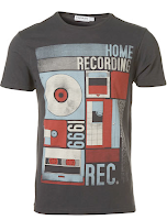
Printed T-shirts such as these;


These items or clothing are popular for people of the indie/rock genre therefore would be appropriate for our music video. These t-shirts with jeans is the casual look which we are going for and want the band to wear.

Daisy
For Daisy we want her outfit to stand out within the crowd. In the beginning of the video when she is about to go out we want her to look very pretty with her hair and make up done nicely, having her look nice at the beginning of the video helps see the contrast to when she is at the end of the video and is a disgrace from being too drunk.

We have chosen these costumes for people to wear as they are realistic and can relate to our target audience. Also the clothes which the band will wear are in the latest fashions and links with Dyers theory of 'Stardom' as it suggest youthfulness which he believes people relate to when watching a music video nd this helps it become successful.

Actor/ Character Profile

Chris Tye
Aged 22
Lead guitarist
Chris will be playing his role of playing the guitar in the performance part of the music video. He is part of the band and also was one of the main contributors towards the composing of the song, 'Actin A Disgrace'


Jamie Bostock
Aged 21 
Jamie will be playing the drums in the performance part of the music video.


Chris Swann
Aged: 22
Lead Singer - Chris will be singer the entire song throughout the music video. He is a big contributor to the song as he wrote and and perfomed it with Chris Tye.


Daisy Ashmore
Aged 18
The 'disgrace'

Role: Daisy will be part of the narrative side of the music video. Her role will involve acting a 'disgrace' which the lyrics of the song are talking about. This will involve her drinking, the use of drugs, and sexual connotations.


Video Location

The Drama Room 
The Drama room will be useful in our music video as for the performance parts of our narrative we will need a plain room which has nothing in it. The drama room is perfect for this as it is all plain black and already has available lighting which we can adapt to make it how we want it. This is why we have chosen this room to film the band in and also because it is easily accessible. When the lighting is changed hopefully it will no longer look like a drama room therefore create a realistic mise en scene for a music video.


The Manor Pub 
The manor pub will be Daisy's local she will filmed inside there drinking numerous drinks and spending lots of money. She will stumble out of the Manor which shows her night only beginning before she moves on. We have chosen to film in the Manor Pub as it is close to our homes therefore shots can easily be re done if need be. Also the atmosphere is similar to what we want as it is the home to people drinking which is what our song is about.


Kristina's House 
There will not be many shots inside Kristina's house, however Daisy will be shown going to bed at the end of the song, showing the end of her night, she will drunkly stumbling up the stairs and falling onto the bed. Kristina's house is a perfect place to shoot the music video as we can adjust the lighting so it is well look and is a realistic setting for a girl's bedroom. It is also in walking distance of The Manor Pub therefore we can have footage of her walking there.


Storyboard

Treatment


Brainstorming


Research Into Websites

Thursday 15 September 2011

Digipaks

A digipak is a patented style of CD packaging and is a registered trademark of AGI World Ltd.

Digipaks typically are made of a book-style paperboard or card stock outer binding, with one or more plastic trays capable of holding a CD or DVD attached to the inside. Digipacks are used by nearly all record companies to hold the CD.
Digipak-style packaging is often used for CD singles or special editions of CD albums. Taking over the use of a jewel case which was popularly used before. The Digipack style became more popular in the 2000's. 
Historically, Digipak was only available in large quantities. However, AGI has recently introduced a new product called digipak i-create for the consumer market. Digipak i-create is a web-supported concept that is aimed at music, photo and creative markets.

Conventions
There are many conventions which a digipak usually follows. 
Digipaks usually have two fonts used throughout which helps keep it simple 
A similar image is used on the front and back
The artists name usually appears quite large on the front of the digipak
The colour scheme is often kept simple to not distract attention from the background image


Here are two examples of digipaks which follow the conventions of a common didgipak. The first two photos are The Kooks album 'Inside in, Inside Out' Followed by the Arctic Monkeys album, 'Whatever People Say I Am That's What I'm Not' 


These album cover both follow a similar angle to what we would like to follow when we make an album cover. The photograps which are used are natural photos and don't look like photos taken in a photo shoot. I think we prefer this also for our album cover. Also the photos have effects on them and are not in full cover i think it both of them this works effectively and makes the title stand out.