Construction
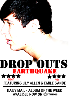
After receiving feedback feedback on my first draft I have made some final changes to produce a final magazine advert. I have completely changed the image that is on the advert to match the image which is on the front of my digipack. I believe this image works much better than the previous one as it is more focussed, clearer and more appealing to the audience. The font and colours also match the digipack. I have kept a similar layout to the first draft as this got good feedback. The colour scheme is also the same following the black and red. I have also included the iTunes symbol on the poster allowing the audience to know where to buy the album. It has still kept to the conventions which are typical of a magazine poster. It has ratings on and also related companies.
Feedback
Final digipack cover
Construction
After gathering feedback on the first digipack I have redrafted it to try and improve it and make it more professional and conventional. I have changed the image on the front of the digipack to one which is more captivating and not so dark. It is also of the person who is featured throughout the video for Drop Outs. As the image has a high contrast the fonts which are used stand out even more. The image on the inside also has a quote from the band and the bands name on on the inside. I think this makes the digipack more personal as the individual members are named. The image which was originally used on the inside of the digipack i have now move to the back cover, and also made it grey scale. I did this as throughout the rest of the digipack all of the images are simple following mostly black and white colours. Therefore having a brightly coloured photo in the middle made it seem out of place. Therefore to make it fit in better with the rest of the digipack I have made it black and white with the red font for the track list. I have also added a barcode and small print of where it was produced, conventional of a usual digipack.
Feedback
Draft Magazine Advert
Construction
Following a similar theme to the digipack cover I tired to use similar fonts and colours. A magazine has similar conventions to a digipack. When making the magazine cover I also only used to different colours throughout to keep the text simple. This is so the writing doesn't completely distract the audience from the image. The image is of the band playing the instruments. This is also seen in the video from 'Actin' a Disgrace' Included on the magazine includes ratings and places available to buy the album. The fonts which are used also are similar to the Digipack.
Feedback
After gathering feedback on my magazine advert, people commented saying they like the simple colour scheme and the text looks really professional and effective. Also they like the layout as it attracts attention to the image as it is in the middle. However, the image is described as weak and the lighting of the shot isn't great. Also the photo is too naturalistic and normally in magazine adverts the people in the photo normally have more of a pose. Also industry icons were recommended to put on, such as iTunes or HMV.
Draft Digipack Cover
Construction -
When making the digipack I tried to stick to many of the typical conventions. I have tried to keep the theme throughout simple. Therefore I used only two different fonts throughout. One for the front cover and one for the track list on the back. I also stuck to a limit of two colours for the font which were white and red. I used these colours as they are bright and bold and stand out against the black image which is used, this creates a contrast. The images which i have used consist of an amplifier, drums and a guitar with plectrum. These images are conventional as they are relevant to the band. The instruments are also ones which are used in the video. The images which are used are also similar on the back and the front which is also conventional.
Feedback -


No comments:
Post a Comment